In 2006, SIGGRAPH returned to Boston. I have a lot of memories of Boston -- I went to grad school and two previous SIGGRAPHs there! Here's some of the stuff I saw or attended this year. The table of contents is in order starting with the coolest stuff!
-- Leo
(note that some links lead to a separate page with the second half of the report)
Morphovision (Interactive)
Image Enhancement by Unsharp Masking the Depth Buffer (Paper)
Manga Colorization (Paper)
Simplified Tree Lighting Using Aggregate Normals (Sketch)
Exaggerating Shading for Depicting Shape and Detail (Paper)
True 3D Display Using Laser Plasma in the Air (Emerging Technologies)
Beer Commercials (Electronic Theater)
Powered Shoes (Interactive)
Model Reduction for Real-time Fluids (Paper)
Tablescape Plus: Upstanding Tiny Displays on Tabletop Display
458nm (Electronic Theater)
Block Modular Rigging Encoded in a Geometric Volume (Sketch)
Single-pass Wireframe Rendering (Sketch)
One Rat Short (Electronic Theater, ET Sketch)
WaveSynth & Point-based Froth in Ice Age 2 (Sketch)
Carlitopolis (Electronic Theater)
Building 1933 New York for King Kong (Sketch and Electronic Theater)
Procedural Modeling of Urban Environments (Course)
Cartoon Motion Blur for 3D Animation (Sketch)
Real-time Rendering of Realistic Rain (Sketch)
Submerging Technologies (Interactive)
ILM 2006 (Electronic Theater)
Real-time Grass with Dynamic Lighting Using Volume Rendering (Sketch)
Directing Plant Animation in Over the Hedge (Sketch)
A Procedural Modeling Workflow for Foliage on Over the Hedge (Sketch)
Collada (BOF)
Davy Jones' Beard: Rigid Tentacle Simulation (Sketch)
Texturing Fluids (Sketch)
Fluid Animations with Dynamic Meshes (Sketch)
Driving Cars - Procedural Animation in Cars (Sketch)
Real-time Video Abstraction (Paper)
Directable Stylized Water Splash Effects in 3D Space in Ice Age 2 (Sketch)
Normal Transformations for Articulated Models (Sketch)
Random Numbers for Computer Graphics (Sketch)
MorphTower/Spiral Swirl (Art Gallery)
World's Biggest Etch-a-Sketch (Interactive)
Cubee (Interactive)
Fast Approximation to Spherical Harmonic Rotation (Sketch)
Progressive Meshing for Videogame Character Animations (Sketch)
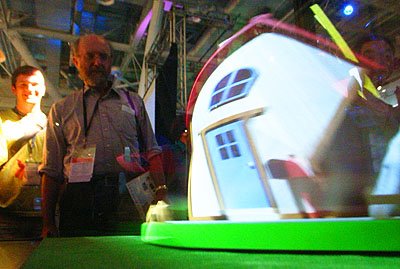 Image credit: Toshi Iwai, http://tenorion.blogspot.com/ |
Toshi Iwai is the most consistently creative technology artist I know of. Last year he and Yamaha showed the amazing Tenori-On. This year, he did something even simpler that was totally cool. Morphovision consisted of a cabinet with a small wooden model (a physical model, that is) of a house with a few bushes, rakes, and the like around it. The model -- unlike what you see at left -- was a totally normal-looking model. |
The model was mounted on a turntable that spun the model at 600 rpm (aka, 10 revolutions/sec). That's where the fun came in! Also mounted in the cabinet was a structured light source -- i.e., a computer-controlled strobe light capable of emitting light in a column, or stripe, of light.
If the strobe light just fired at a synchronized 10 Hz, you of course just saw the house perfectly still in the cabinet (even though it was spinning like mad, it looked quite still in the strobe). So that was kind of neat right there, but the real trick is that by varying how the stripe of light moved and how it was synchronized to the turntable, they could totally change the appearance of this physical object. If it carefully timed the stripe of light before and after the house was in the same place, it could twist (as in the picture), bulge, or even turn into a sinuous curve. Even better, as you kept changing modes (the user had control of which modes it used), you could "slice" it into a stack of house-slices, or even dissolve it into a string-sculpture-like assemblage of little streaks.
This is really totally cool, and actually shows up pretty well in pictures. Consult Google for Morphorium, or check Iwai's website at http://tenorion.blogspot.com/.
This was a series of three cool water-based installations. There was a water harp, a surprisingly simple idea: a series of streams of water fall from a top bar, and land on photo sensors. The water streams have lights shining straight down them, and so they act kind of like lossy fiber optic cables. When the user "plucks" a stream, the photodetector sounds like appropriate note. You could actually play it (it's tuned like a piano!).
The other one I liked was a sheet-of-water fountain that detected the approach of the user's hand by capacitance and moved away from your hand. Very funny!
 Photo credit: University of Tsukuba |
Only in Japan! These shoes have sensor-equipped, motor-driven wheels in the bottom so that they act as both an input and feedback devices when you're wearing a head-mounted display in a virtual environment. In the virtual environment, you just walk in the direction you want to go, and the sensors on the shoes determine how fast you move in the virtual world (will a bike helmet be required for World of Warcraft 3?). The motors in the shoes can provide force feedback as well as limiting the motion of your foot across the virtual world. Yet another way to get exercise while playing a videogame! Alas, one of the shoes had broken by the time I went by to try it, so I was doing virtual scooter riding rather than virtual walking, but it's a totally awesome idea. The primary author was Hiroo Iwata, iwata (at) kz.tsukuba.ac.jp. |
|
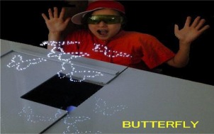
Really something you shouldn't do at home! This display had three high-powered lasers pointing upwards. Each laser (or more likely, a mirror in front of them) had a computer-actuated mirror that controlled the laser's direction. If they made all three lasers focus on a single point in the air, the air in that area heats up so much that it turns into a plasma (you know, like the sun!). |
They had a series of little demos that did geometric figures, butterflies, and so forth out of little dots in the air. It's a pretty trippy thing to see, and it's also very loud -- they only ran this for 5 min. every half-hour, out of consideration for the ears of everyone in the Emerging Technologies area. Read more about it at http://www.burton-jp.com/BurtonNw.htm.
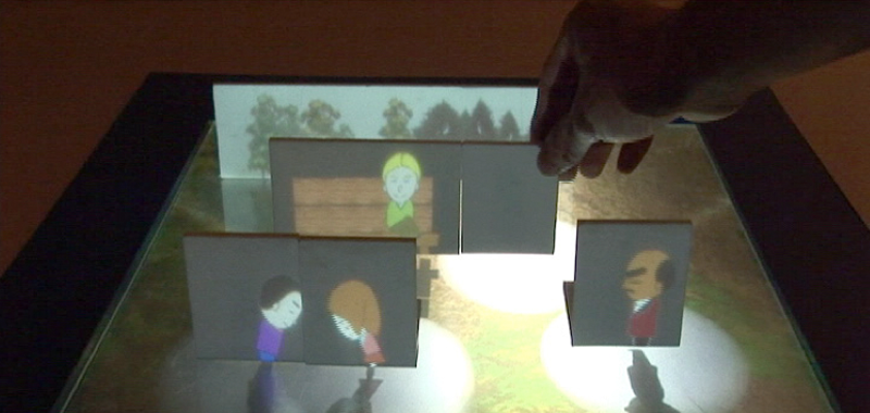
This was a very neat tangible interface from the University of Tokyo. Each of the vertical cards in the above photo were mounted on a base that let you move them around in the scene. As you, for instance, moved one of the characters next to the park bench, the character would then sit on the bench (that's what just happened above). If you brought two characters near each other, they would first bow to each other (as the two on the left are doing) and then start jabbering in a Simlish-like unintelligible language.
The characters were really cute and this interface was very fun to play with. In the demo system, there weren't enough interactions to make it interesting for more than a couple minutes, but it's a neat interface! The project website (English) is at http://www.hc.ic.i.u-tokyo.ac.jp/project/tablescape/. There was also a similar project called Deskarama where the movable card served as a virtual cut plane into a 3D scene (it was just less fun).
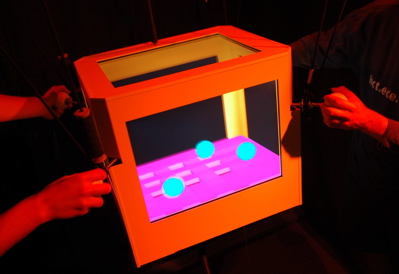 |
Cubee was a project from the University of British Columbia with six screens mounted in the six sides of a suspended box. The user wears a head tracker and therefore the six displays present a coherent visualization of some imaginary insides of the box (of course, you can only see three displays at once, but by twirling the box you can look in from anywhere). It worked pretty well (the funnest demo was working a ball through a 3D maze with simulating gravity) but I couldn't think of many applications where this is really better than a desktop display. |
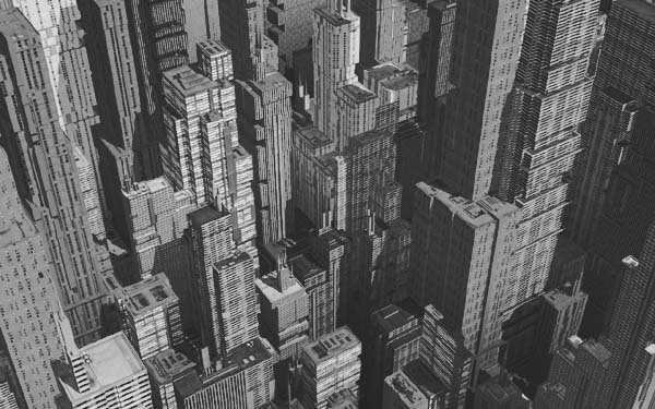
This was a half-day course, but the only lecture I saw (which I heard was by far the best) was from Pascal Müller from the Federal Institute of Technology in Zurich. Muller also had a paper in SIGGRAPH this year; his paper is available here, so follow along in that if you want a deeper explanation. This was pretty much the first time I've seen a presentation on procedural generation of cities that I thought did a better job than SimCity. If Maxis is going to start working on SimCity again, the first step is to hire this guy. His wiki is here.
Here are my notes from his course talk on CityEngine, his city-modeling tool. I didn't necessarily takes notes on every element, because his paper on CityEngine is already available here.
CityEngine isn't an automatic generator, but an interactive tool for very quickly generating buildings. "It never happens that you just hit the button and everything looks great."
The general workflow is as follows: If you're modeling from scratch (he can also start with a user-specified street or lot grid), start with an extended L-system for streets. There's an L-system that generates major, then through, then minor streets; however, instead of being a pure L-system, it incorporates two other elements: there's a global goal system (for instance, connecting to neighboring areas) that influences where the L-system is applied; and secondly, there's a local reaction/diffusion system to try and maintain sensible street spacing on the small scale.
Defining Roads and Lots: Once the streets are established, it generates 3D road data out of the vector paths from the L-system (this should sound familiar to SimCity engineers). Then, the "blocks" defined from this need to get divided up into lots, each of which will be filled with an individual building.
At this point, you save the city because the rest of the work is essentially parallel within each lot. He talked about all the competing Geographic Information System file formats out there:
| KML | Keyhole Markup Language. Generally the best format, associated with Google Earth. |
| GML | Geographic Markup Langauge. Basically an open-source version of KML. |
| SHP | This is the format associated with the commercial GIS system ArcView. |
| DXF | The lowest-common-denominator format, still used by many GIS systems. |
Obviously, if you're using a user-defined street or lot grid, you read that in to continue from this point.
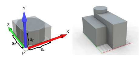
Modeling Massing of Buildings: Now, for each lot, we need to decide what the building that fits on it is. He starts by creating a bounding volume from the lot and statistics about population density and usage. Then, he uses a rule-based system (which includes some randomness) to replace each element of the building mass with a subdivision into other shapes. The library of shapes (cube, cylinder, etc.) and the relative sizes are governed by rules intended to capture the architecture of the time (e.g., "Art Deco" or "Roman Villa"). Here's an example from his "International Modern" ruleset:
Building Facades: Now that the masses of the building are established, he used a similar rule-based system that divides the facade up into multiple areas, adds details like column capitals, dormer windows, and so forth. An example rule he showed was:
1: facade(h): h > 9 -> floor(h/3) floor(h/3) floor(h/3)
The meaning is this rule is: For a facade of a given height, if the height is greater than 9, replace it with three "floor" elements, each of 1/3 the height of the original. Another, more complicated rule that gave rise to "Old Chicago" style buildings was
2: facade -> Subdiv("y",3.5,0.3,3,3,3) { ff1 | ledge | ff2 | ff2 | ff2 }
The meaning of this rule is: replace the facade by a sequence of elements "ff1", "ledge", and then three "ff2"s, where the space in Y is subdivided proportionately in the proportions given. In addition to these production rules and Subdiv rules, there's a "Repeat" rule which allows for repeating approximately as many sub-elements as there are space for -- the "repeat" rules are the ones which particularly allow for creating windows.
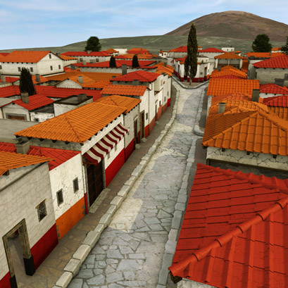 |
One of his coolest examples was a reconstruction of Pompeii, the roman city buried under a pyroplastic ash flow from Mt. Vesuvius. Because of many archaelogical expeditions over the years, we know the street elevations plan, building materials, and a fair estimate of the population density of Pompeii, but we don't know the details of many of the buildings. They started from the street and population density maps, and interviewed researchers in order to derive the rulesets for generating Pompeii's buildings. The coloration and decorations were well-established from Roman-era archaelogy. |
One of the great things about this example was that it was fast -- Pascal said it took about 1 day to create the GIS data, 1 day to create the rulesets, and 1 days to create the individual elements (windows, roofs). They used Greenworks' XFrog to create detailed, biologically correct plants that the rulesets scatter throughout the cities.
In all his cities, he bakes ambient occlusion into the buildings as part of the outdoor lighting pass. If you check out his examples, you'll find that this multi-layered approach gives rise to very interesting, varied, and yet thematically unified cities.
This was a sketch about how they did the water in Ice Age 2. Basically, they added up multiple octaves of Gerstner waves (a simple wave model first proposed by Bill Reeves in Pixar's classic Road to Point Reyes image). The cool thing about this sketch was that everything other than the point-based froth could easily be implemented in the vertex shader nowadays! (in fact, there's already an article on Gerstner waves in the shader at http://www.shadertech.com/cgi-bin/shaders.cgi?filter=-1&page=4). Here are the detailed notes.
For Ice Age 1, we did very realistic water. For Ice Age 2, we had these requirements:
To address this, they developed two new methods: WaveSynth, and Point-based Froth.
Wavesynth is a toolset for creating water surfaces. It's procedural, but embedded in an artist-directed tool. The basis of WaveSynth are Gerstner waves. These waves are smooth at low amplitudes, but become "peaky" at higher amplitudes, making them a decent first-order approximation to fast-moving water waves (obviously, as a height-field-style solution, they can't actually "break").
The basic tool in WaveSynth takes a colleciton of Gerstner waves and sums them up. By directly summing them, they retain their peaky-ness, and LODs are very easy (earlier solutions tried much more complicated solutions for combining Gerstner waves). The artist can set the spread of frequencies, amplitude, speed, and spread of directions. That's called a Wave Set in the tool.
The artist could also paint maps detailing where different wave sets intersected with each other. They used this to have smaller, more turbulent waves around a character in the water that blended back into the bigger waves further away.
Also, to do waves flowing down the river, they animated the offset of the smaller waves across the stationary, larger waves -- the effect was demonstrated in many of the Ice Age 2 shots and looked very convincing.
They wanted to create lots of white water in order to enhance the sense of peril that the water provided, and also to help read the water speed. In order to get the white froth wherever the water intersected with characters or with the environment, they developed a completely automated point-based froth system.
All the characters and environments were converted to point clouds by sampling points on the surfaces. Wherever those point clouds intersected the water surface, froth particles were generated. The froth particles were then run through one step of a laminar flow simulator which pushed them "downstream". Since this usually took them off the water surfaces, they were then projected back onto the surface and rendered as a decal on the water.
The actual splashes kicked up by the characters in the water were made differently; see the description of the sketch Directable Stylized Water Splash Effects in 3D Space in Ice Age 2.
 |
There have been some great techniques for real-time foliage at SIGGRAPH lately (see for instance, the awesome trees in last year's report). This sketch took an agressive LOD approach that allowed it to go all the way from rendering individual grass blades to texture-based approximations with smooth gradations. The full report on their technique is online. |
They subdivide the terrrain to be potentially covered with grass into uniform patches. Within each patch, they choose one of three representations of grass to be drawn: the most detailed patches are drawn with individual grass blades using instancing; the next LOD is drawn with both horiztonal and vertical grass slices with planes; and the farther terrain is drawn with only a horizontal textured plane.
In order to support dynamic relighting, all three of the LODs don't store a lit value but rather store a BTF (Bidrectional Texture Function) expressing the materials' bidirectional illumination properites. In order to make this feasible, they quantize the incoming and outgoing directions severely: to 5 light directions and 2 view directions.
Of course, they can't assume the grass is uniform, so they use a painted density map across the terrain surface. Because they draw the high LOD with instancing, each patch is made of the same # of blades, but each blade is tagged with a density threshold. Thus, when it's drawn, the blade is only shown if the density map value exceeds that blade's density threshold.
Similarly, for the horizontal and vertical grass slice textures, a density threshold is stored in the texture. This value is different for each blade rendered into the texture, but uniform across that blade; so even in the slices, individual blades come and go as the density varies.
In order to get smooth transitions between the three LOD regions, they multiply the density map by a function of distance from camera, then draw the terrain tiles in the transition zones with both LODs. Because individual blades are turned on or off by this technique, it avoids the artifacts you get from simply cross-blending the LODs.
To shadow the ground, they project the geometry onto the ground and set the stencil buffer. Similarly, they project the slices' shadows onto the ground.
However, to simulate the effect of one blades shadowing another (necessary for dynamic lighting of the grass), they compute a single cylindrical occlusion map showing the other blades in the patch as seen from the point of view of one blade. There's actually only one of these occlusion maps, but it's rotated randomly for each blade of grass.
Then, at render time, for each vertex in the instanced grass blade, intersect the light vector with the cylinder to get the texture UVs, then let the fragment shader intepolate them to get the occlusion value. Note: they didn't actually explain how they handled inter-blade shadows in the slice LODs.
A problem that PDI had from Shrek was lighting trees: they had fantastic procedurally-generated foliage geometry, but it was very heavy and composed of a multitude of details (leaves). How could lighters actually see the geometry they were trying to light? In the real world, we clearly perceive shape in foliage. Artists' hand-drawn trees also operate this way -- they think in terms of tree leaf masses.
Some references:
The shading dilemna is this: at the micro-level, the leaf shape is uncorrelated with the macro-level leaf clump. How do you provide a normal for the lighter to use that can reflect the leaf clump shape?
Basic idea: approximate the branch with a blobby surface. If you've studied blobbies before, you know that they don't directly define a surface; intead, they define a scalar-valued potential function over space. So, don't generate a surface, but instead, at each of your leaf vertices, sample the gradient of the potential function. This gives an "aggregate normal" you should record on the geometry and pass in to the shader.
Now, in the shader, you'll take some average of the aggregate normal and the actual geometric normal of the leaf to light the leaf (or if you want, light both and average the result). For Shrek 3, they use a 50/50 average of the two normals. For Over the Hedge, they used pretty much 100% aggregate normal, ignoring the geometric normal.
That was it! The images they got from this (see practically every shot in Over the Hedge) really are much more storybook-like lighting than any traditional lighting scheme. Although they're interested in incorporating ambient occlusion into their scheme in the future, it already provides much of that effect just because the dark side of the tree goes dark through the aggregate normals.
One questioner asked a good question: he wondered whether the reason this was an improvement was because most procedural plant methods produce too random a spread of directions in leaf directions, when in fact most plants are fairly correllated.
The requirements they had for a dynamics system for the plants on Over the Hedge were:
Their trees were already generated from a modified L-system, so the order of deformation was well-defined. They took the branch points from the L-system as the rotation points of the deforming body; then, for the longer branches, subdivided them.
The deformation physics were based on the cantilever model from the Euler-Bourneulli equations, which gives rise to a lot of bending but almost no elongation. To solve those dynamics, they simply simulated it as a mass-spring system, with forces pulling the pivots back towards their rest pose.
After the simulation had run, it would inevitably pull some of the branch segments away from their rest length. They corrected these back to their rest lengths from the root out to the tips, which resulted in tensile accelerations. They then allowed a very small amount of elongation back into the simulation if the tensile accelerations were great enough.
Animation requirements were very modest: the animated the rate of dissipation to prevent oscillations. There were local "wind" sources for additional control when needed. They basically ignored branch-to-branch collisions; with motion blur they're pretty invisible anyway.
They showed some great examples of highly-non-physical animation generated from the system that illustrated the difference between "plausible" and "correct": in many of these examples, the characters were moving so fast that a real branch would have been torn apart!
Bottom line: simple and robust. Another big advantage was that each plant could be simulated independently. All of the simulation results were just baked back into rotations on the plant branches to facilitate finaling.
I didn't type up my detailed notes on this sketch because it followed a fairly predictable, if well-done, implementation path for a procedural tree sculpting system. There are a couple good tidbits:
This was a new technique that allows textures to be displayed on the surface of a fluid simulation, making a lot of rendering techniques possible. It wasn't especially amenable to real-time implementation, since it involves re-tesselating the fluid per-frame, but it was much better than previous work on texturing fluids. If this is a problem you need to solve, check out their detailed website.
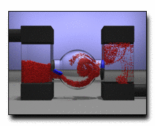 |
This was a great update on some progress that's been made in being able to simulate fluids that both push on and are pushed on by solid objects in the environment. Like a lot of the simulation work recently, it came out of James O'Brien's group at UC Berkeley. Unfortunately, this kind of advanced work is still a ways away from real-time -- they were trying to get it down below 1 min./frame for simulation -- but it definitely pushes back the restrictions on what we can simulate. They have a great website about the paper on the berkeley site. |
 |
Real-time Fluids!!!! Real-time Fluids!!! That's really what they mean! This is the paper version of some work that Zoran Popovich has been doing in cooperation with EA at the University of Washington for the last few years. The website for the work is here. |
The actual technique they use is very, very esoteric. If you know how vector quantization compression algorithms work you've got a first grasp on what they're doing: they're trying to build a compressed simulation of a large space (say, a 2^400 dimensional space) with a smaller space (say, a 24-dimensional space). They use huge a priori search techniques to narrow this down and then run the simulation only in the smaller space, resulting in the ability to get pretty fun fluid simulations going at reasonable framerates (24 fps on a fast PC). You should definitely check out the paper, or at least the demo movies, if you're interested in this sort of thing. Maybe this can be what those SPUs on the Sony PlayStation 3 are actually good for!
 |
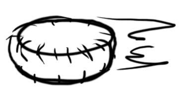
This sketch was from an old-line Disney effects animator (John Thornton, jdt (at) blueskystudios.com) who went to Blue Sky to work on Ice Age 2, and it was about how they created a very lightweight rig for animating water splashes. In fact, the water was still being driven by a physics simulation, but the rig (which looked something like the image at right) allowed the effects animator to explicitly specify the goals for the simulation. This system must have truly been easy-to-use, because he had dozens of examples created specifically for the sketch. He could obviously produce new splashes trivially. Note: this image isn't from the sketch, it's just me reproducing what the rig looked like in his figures. |
Inspiration Rooted in 2D Design
Drawbacks of Physically-based Tools
Solution: The "Splash" Rig
Workflow
System always produces ballistic motion of water particles
Strengths
 |
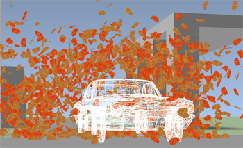
Thesis: Directors want to be able to stylize motion blur just like other elements of the film. This sketch was about the various techniques that PDI developed in three different situations to enable very stylized motion blur -- I'm sorry I couldn't get a hold of any of their images other than the tiny one at left, because the motion blur that resulted was very stylized and fun! |
Duplication
Creating the Blur Patch
Rendering the final motion blur
Above: the trailing blur, but with the red-and-white hard candy at the leading edge, was what they were trying to create. |
There's a scene in this short where Rico emits those hard red-and-white candies as though they were coming from a machine gun. The director wanted the sort of "flames coming off" effect where a motion blur -- that still had the recognizable color of the candy -- trailed behind the candy as it came out. But, the candy itself should be recognizable at the leading edge of the motion blur. They tried standard motion blur techniques, and they looked terrible -- the candy was unrecognizable and the blur was ephemeral. |
They knew about the sushi knives trick, so they did something similar to it. They randomly scattered particles along the front-facing surface of the candy, and sampled the lighting data at that point on the surface. Then, they streaked the particles along the negative velocity direction from that point. This was rendered as a separate pass and comped on top of the candy, which was rendered with just a tiny bit (5%) of traditional motion blur.
 |
The character of Hammy in Over the Hedge is a hyperactive, incredibly fast-moving squirrel. He's a very funny character (and the basis of the best gag in the whole movie at the end!). They wanted a consistent motion blur effect they could use for Hammy throughout the show to express his speed and direction. |
They tried the sushi knife technique, but in this case the streaks behind Hammy actually made Hammy look slower rather than faster. The key change was that they gave the particles a little delay so that there's a gap in each frame between Hammy and his motion blur -- as though the blur itself can't quite keep up with Hammy because he's so fast. This -- plus ghost images of the legs from the two previous frames -- was the effect that ended up in the movie.
WETA Digital did a great job of making a very compelling version of 1933 New York for King Kong -- interestingly, in many cases paralleling Pascal Muller's techniques from his paper. They then put together a very nice quick overview video for the Electronic Theater as well as a sketch. Here's an overview of what they presented in this sketch.
One Rat Short was the Grand Prize winner in the Electronic Theater this year. It's a relatively long short film (about 8 minutes) with no dialog and with two rats as the main characters. I liked the film (thought the ending was a bit of a non-ending, but after I've made a fantastic short I'll have more right to complain). I went to the artist's sketch where Alex Weil from Charlex, the director, talked. Here were a few of his more choice comments.
"I discovered along the way that a short film [as opposed to a feature] doesn't need a story arc, it just needs a story."
He said the story/script/storyboard process didn't work for him, and he ultimately abandoned it. "I had to make this movie in order to make this movie."
"I saw that scene [the opening shot of the movie], with the rats in the alley and the stylized lighting and the blues in the blacks... that's when I started to be able to write the movie. I wrote the movie out from that scene."
"John [the Director of Photography] is the one who introduced me to that concept of the... what's it called... the color chart? Oh, the color script. I don't know if that in the back of the Pixar book but he really introduced me to that idea and it really helped me. I would never have thought of that, but it really worked out well."
Q: "How much of what you animated ended up in the film? A: "We cut a lot. It was really a lesson in filmmaking. I'm known in NY for being the doctor, for fixing other people's work. I had to learn how to do that to my own work. You gotta cut to the bone. In the end, we cut 11-12 minutes down to 8 minutes. That's a big cut, at least for me." [Ed. -- Yeah that's a big cut alright!!!]
This was some work at attempting to have an automatic, smoothly varying LOD scheme for skinning for background/secondary characters. It was joint work between University College London and the EA UK studios.
I hate to speak negatively about work, but after a lot of work and careful coding, the speedup they claimed in the sketch was only from 215 fps -> 265 fps. 20% speedup for reducing the character to 3 bones and required special constraints on the bind pose (this work was not done in the game, for good reason) wasn't very impressive for an optimization research imho.
This fantastic sketch was by Jeff White and Jason Smith from ILM. It represents how everyone should do rigging and skinning! It turns out that in a different sketch, Rhythm & Hues presented their extremely similar rigging/skinning pipeline. Here are the advantages of their set of techniques:
The strongest result from this technique is that they claimed they had on-screen creatures in the Chronicles of Narnia movie where the weighting of the creature was not adjusted by hand! They used this to succesfully transfer rigs and weighting between fairly unlike creatures, such as a human and a dwarf or a horse and a boar.
There are essentially two techniques they use to accomplish this: one is the pervasive use of volume guide geometry, and the other is block modular rigging. Here's an outline of how each of the two techniques works, starting with Volume Guides.
Build the Default Rig
Building a Particular Other Creature
Block Modular Rigging
Building Modular Creatures
This sketch was by a couple old friends from Pixar on the way they integrated procedural animation into the rigs for the vehicles in Cars. This system was used on every vehicle (and therefore every character!) in the movie.
Cars are tightly coupled to the environment
Philosophy
Simulations bake back onto bones in the rig
Pathing System
Ground Contact
Suspension Simulation
Tunable Simulation Constants
Wheel Weight and Tire Bulge
The character Davy Jones in Pirates of the Caribbean II has a beard made up entirely of tentacles which called for tremendous amounts of both secondary motion and of acting motion. This was a sketch by Brice Criswell (R&D Engineer) and Karin Cooper (Character TD) on how the beard was created.
Tentacle Simulation
Stiction
Sinusoidal Motion
Statistics
The amazing fact revealed in this sketch is: The normals we get from skinning calculations are simply incorrect, and often very incorrect. This sketch was in a session called "New tricks for old dogs" which was an apt comment!
The full tech report is available here, but here's a summary of what it explains. To get the normal we use for shading skinned models, the transform the model by the inverse transpose of the matrix. However, because the normal actually should be a function of the continuous surface at the point where we calculate the normal, it need to take into account the fact that the surface's derivative is affected by the changing skin weights as well as the bone transforms.
Once a corrective term is developed for the derivate of skin weighting, various examples show that the classic transformations produce normals that really are not normal to the surface anywhere that the weighting values are rapidly changing!
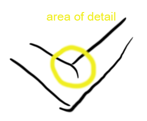 |
You may ask... Why have we not noticed this? Well, that's sort of the anticlimactic part. See the example figure at right. The places where the two calculations are different is where the weighting value tend to be changing rapidly, such as elbows (on the forearm or upper arm, where the weighting values tend to change much more slowly, the differences aren't as large). Let's look at the inside of the elbow area, as circled in yellow. |
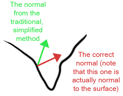 |
Skinning (uncorrected) usually produces a deep trough at such locations. In areas like that, the tranditional simplified normal calculation produces normals that tend to point more up out of the concavity, as shown in green. The correct normal -- i.e., the one that's actually normal to the surface -- points more down into the concavity. So, although the green vector isn't normal to the surface, it's more pleasing for most purposes than the correct normal. So... we're not really likely to all go back and fix this even though it's fairly easy to calculate the corrected normal... |
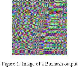
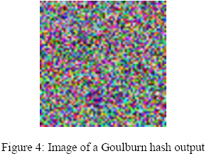
Another new trick was presented in this sketch by Mayur Patel from Digital Domain. The tech report is online here. He was investigating better sources of random number for computer graphics, and eventually developed the Goulburn hashing function that achieves a high degree of randomness with a very fast implementation.
| Along the way, he discovered that several widely used low-end hashing functions, such as Buzhash, generate very non-random results! At below left is an image of the Buzhash hashing function used as a pseudo-random number generator, at below right is the Goulburn hash they developed. | |
 |
 |
They also compared using Goulburn to using the fastest current implementation of Mercenne Twister, the current 'gold standard' of random number algorithms. Goulburn is faster than Wagner's implementation of Mercenne Twister on low-end processors, but about the same on faster processors. The biggest advantage of Goulburn relative to Mercenne Twister is that Goulburn's state vector is a single integer of the size of random number you want; Mercenne Twistser, by comparison, has a several-hundred-byte state vector.
There were two Collada-related events at SIGGRAPH. There was a Collada BOF and social hour Wednesday evening, and a set of Collada Tech Talks Thursday at Noon (there were several other events relative to the Khronos group activities, and the Khronos Group actually had a booth on the show floor.
At the Collada BOF, I got to meet Christian LaForte and the rest of the crew from Feeling Softare, who implement the Collada exporters for Maya and 3D Studio Max. It was fun to talk to them about using Collada and about some of the problems I've run into with it (note to self, need to finish Python ColladaViewer project!). They talked about some of the new projects they're doing at the presentation section, notes are below.
I also got to meet a couple guys from Google. Google now uses Collada both as an export format in SketchUp! and as an inport format in Google Earth (in fact, their KML language for Google Earth uses Collada as its sub-format for 3D geometry). We talked for awhile about Collada-world developments with them.
I found out that bug reports for the Collada exporters should be entered directly in Feeling Software's Bugzilla instance, http://www.feelingsoftware.com/bugzilla/. Here's some of the other stuff they're up to.
FCollada: C++ Collada API library
ColladaMaya
FeelingViewer
Sachiko Kodama, the artist behind the amazing Protude: Flow from SIGGRAPH 2001, was back with a new variation on the magnetic-liquid called MorphTower/SpiralSwirl. If you've ever seen Protrude: Flow, you'll know why it was neat -- if you haven't seen it, definitely check out the website at http://www.kodama.hc.uec.ac.jp/protrudeflow/works/002/index.html.
Cinematrix, the company started by Loren and Rachel Carpenter to bring the crowd-interaction technology first used at SIGGRAPH 1991 to the rest of the world, came back this year to do another fun audience-interaction show. If you don't know about this system (with the red/green paddles), I'll let you read about it at their site, but the two cool audience games they brought this year I've never seen before were:
This was sort of poignant, since it represented, in two different ways, a negative result (and the risks of submitting to the sketches program, where things can change noticeably between submission and the conference!)
The problem domain they were working in has to do with rotating spherical harmonic lighting coordinates. For many applications, you want to store those at the vertex, and thus you need to rotate them from surface-relative coordinates back into world coordinates for applying the results.
The previous best idea for doing this, by Kautz et al, was to decompose the generalized rotation into two rotations about Z (which because of the way spherical harmonics are formulated is intrinsically fast) and a rotation by +/-90 degrees in between.
Their newer idea was to directly implement the original XYZ rotations by creating a "1.5th" order taylot series approximation to the rotate in Y. Originally, they found this was 3-4x faster than the Kautz method, even though it's less exact.
But then... they disocovered that the performance of the Kautz method is very dependent on whether or not you "unroll" the matrix calculations in it. By unrolling those, Kautz's method can be implemented in approximately the same performance as their method -- and thus, they ultimately recommend you not use their method! This is what they discovered after the sketch was submitted and accepted.
But even more unflattering... In the newest DirectX SDK, Microsoft optimized the built-in Spherical Harmonic rotation function (presumably by applying Kautz' method), such that it's as fast as any of the other methods discussed. So, their entire sketch is mostly obviated by a DirectX function call now. That's how the graphics ball bounces!
This sketch was from Microsoft Research and was about a technique for rendering rain with Precomputed Radiance Transfer in a very dynamic lighting environment. The complete tech report is at ftp://ftp.research.microsoft.com/pub/tr/TR-2006-102.pdf, and a length, high-res movie of their rain is at http://research.microsoft.com/~zhoulin/Rain.wmv. The cool part about their rain, if you watch the movie, is that the rain picks up the appropriate colors from the environment, based on an envmap they captured when they took the real video. The raindrops around the red traffic light are red, but turn green when the traffic light turns green.
Basically, they precalculate a model of the refraction ray direction based on eye vector for a generic raindrop, and precalculate the radiance transfer involved. Then, for each raindrop (which is a card with an alpha texture), they look up the environment map in that direction and apply the stored radiance transfer function.
Their framerates are good although not quite ready for a commerical product -- the rain rendering runs at between 80 and 200 fps, but with nothing else drawing, on a GeForce 7800 GTX. Heavy rain took from 40K-70K rain cards, and total memory usage apart from the environment maps was about 6MB.